Client: Harker Doerre Construction
Project Type: Branding / Logo Design
Project Type: Branding / Logo Design
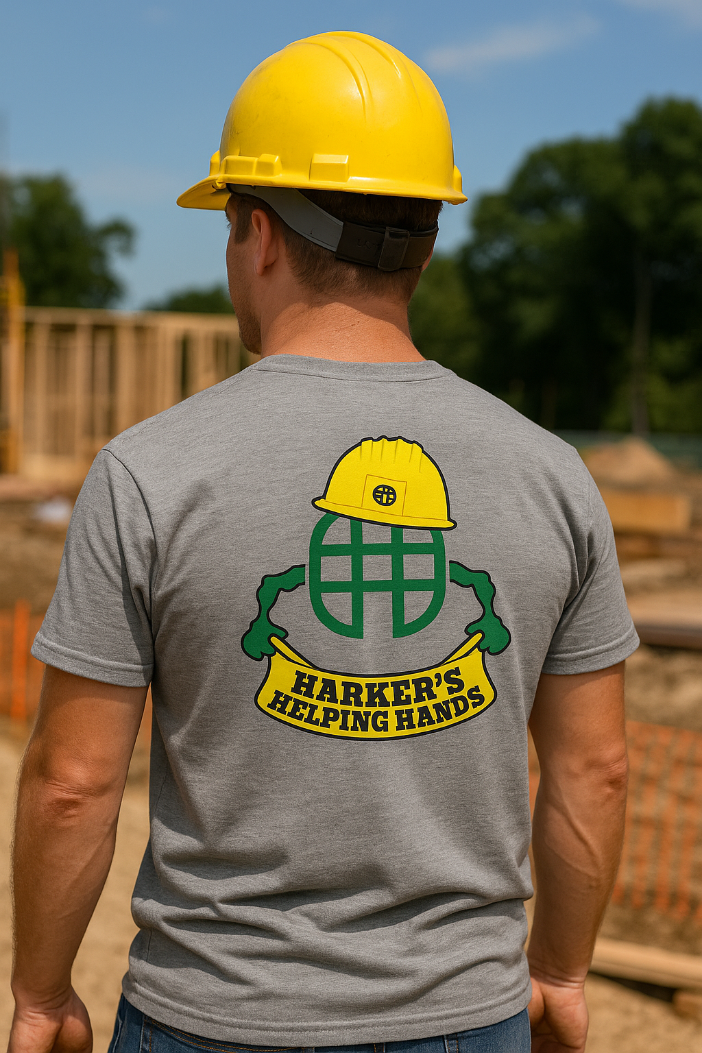
Harker Doerre Construction tasked me with developing a bold, approachable identity for their internal community service initiative, Harker’s Helping Hands. The program celebrates the company’s dedication to giving back through hands-on volunteer efforts, and the logo needed to reflect both the brand’s construction roots and its spirit of service.
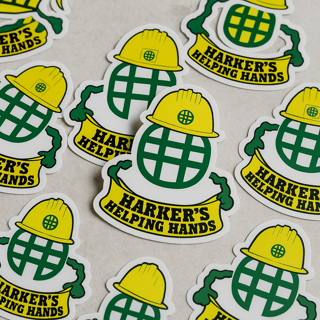
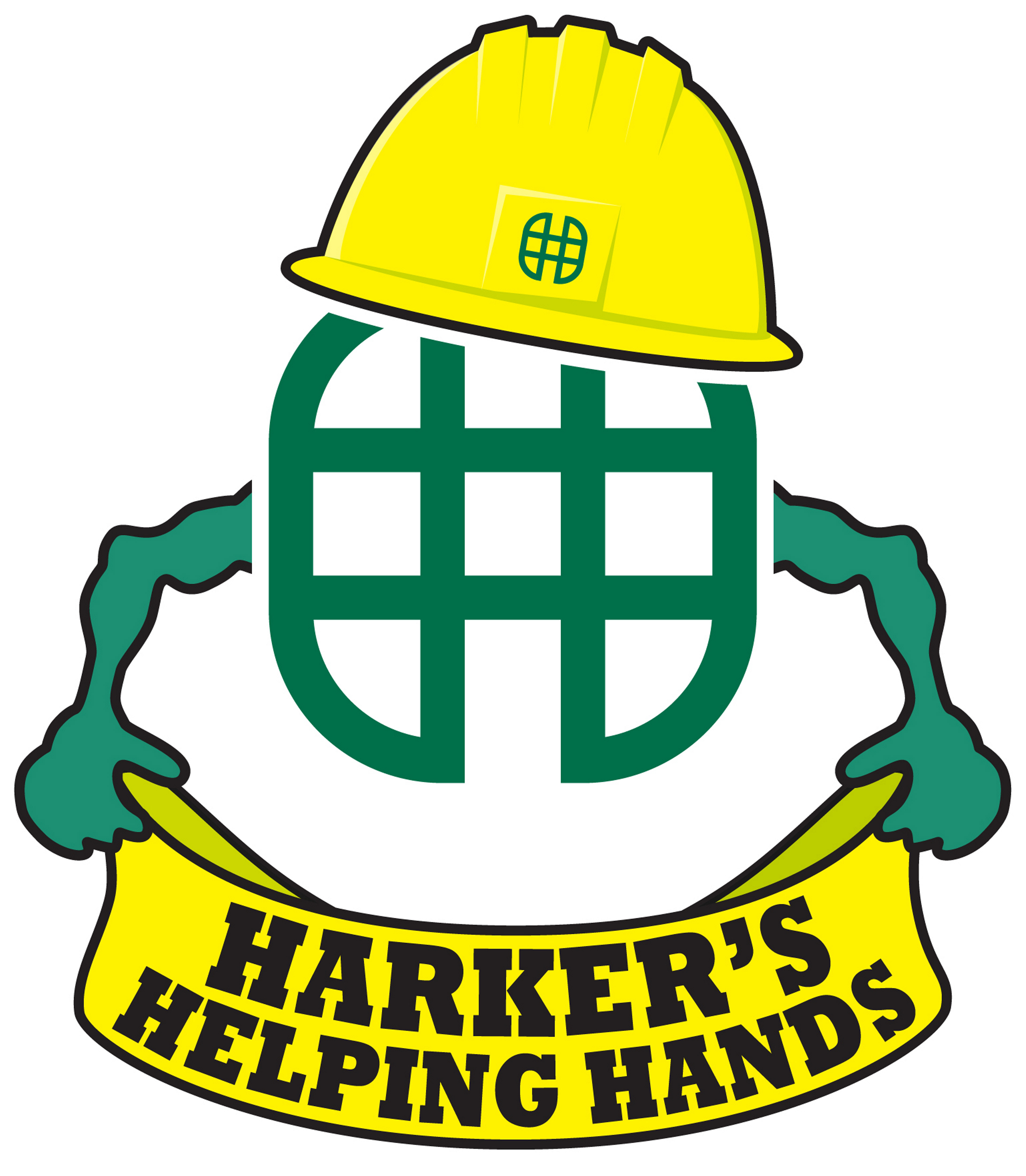
The final design features a friendly yet professional emblem: a globe-inspired "H" mark (a nod to Harker Doerre’s identity) is topped with a bright yellow construction helmet, representing safety, teamwork, and construction expertise. The helmet also includes a miniature version of the company’s grid logo for brand cohesion. Two stylized green arms frame the globe, symbolizing helping hands and collaboration. A bold yellow ribbon banner grounds the mark and proudly displays the program name in a strong, high-visibility font reminiscent of job site signage.
Design Goals Achieved:
• Unified the visual identity with Harker Doerre’s core branding through logo integration
• Incorporated recognizable construction imagery to reinforce the company’s expertise
• Created a scalable, print-friendly design suitable for shirts, banners, and promotional materials
• Delivered a playful yet professional look that encourages participation and pride
This project demonstrates my ability to translate brand values into graphic storytelling, using iconography and typography that balances corporate integrity with community warmth.